Kody · 2025 · Design System · AI-assisted

Rebuilding the Kody Design System

旧版 Kody 设计系统全览

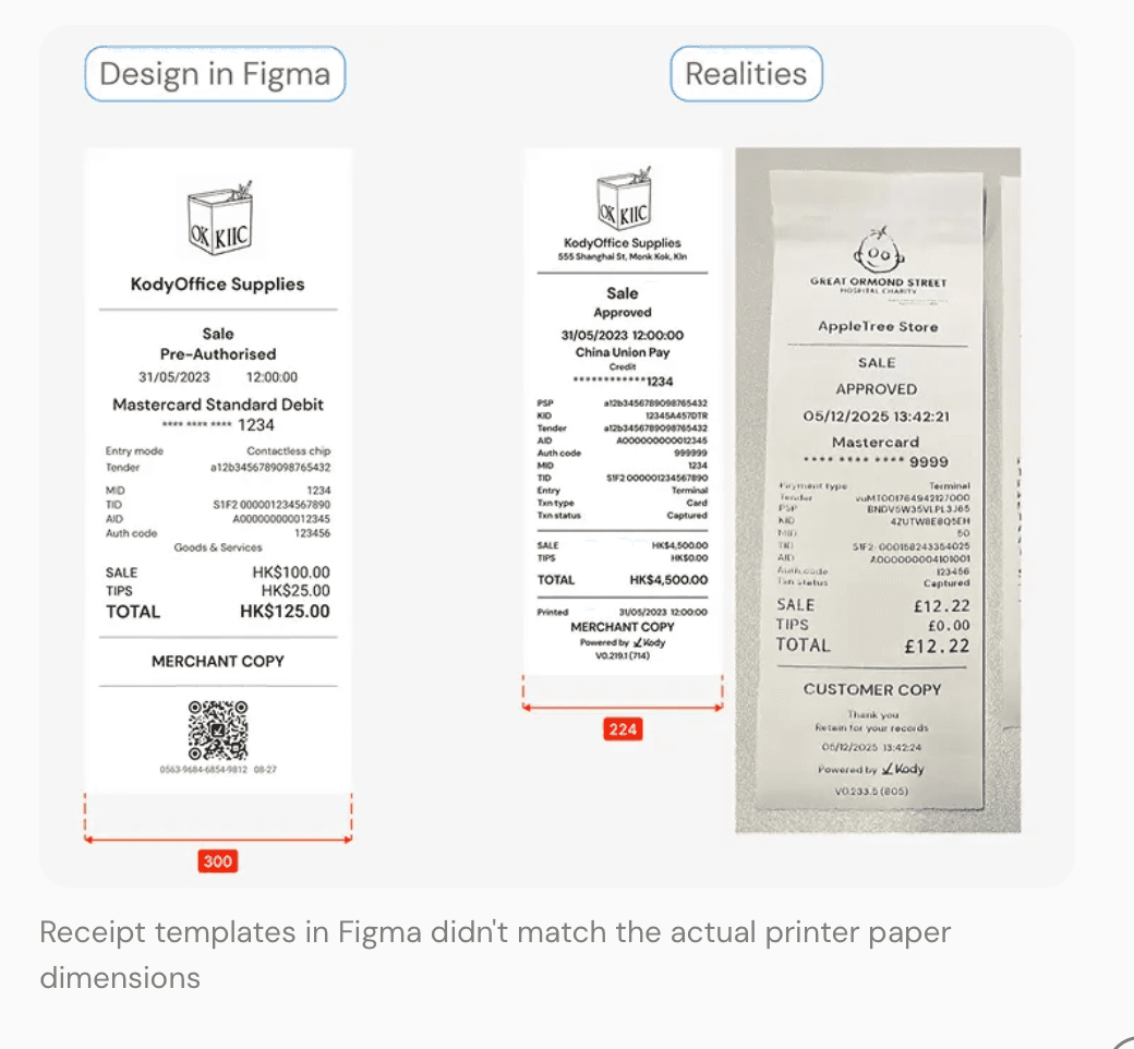
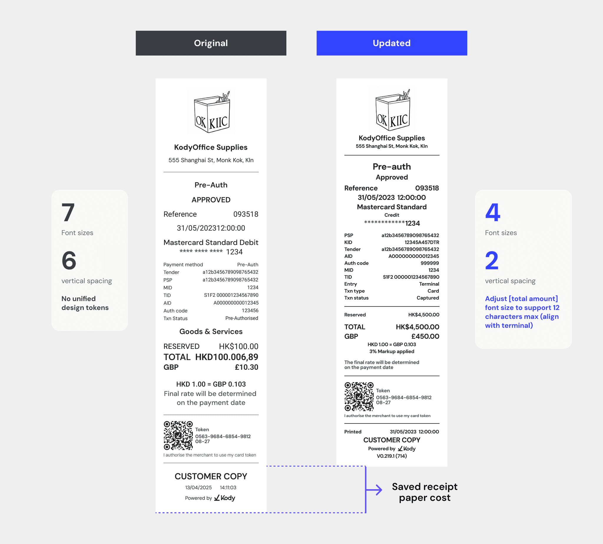
"Reduced foundation tokens by 76%, cutting design-to-code handoff ambiguity and enabling a 13% reduction in receipt paper usage across the merchant network."

Kody's product ecosystem had grown into four platforms, each evolving independently. As the system scaled, the UI became fragmented — slowing down delivery, creating inconsistencies, and making design-to-development alignment difficult.

I led efforts to bring structure by defining a shared foundation and constrained reusable components that could scale across 4 products.

Case Study

Rebuilding the Kody Design System

Multiplatform

Kody has multiple product streams:

Terminal

Offline payment experience

Terminal APP

Android companion app

Receipt

Physical artefact that is printed

Kody App

Bank application

Kody Universe

Merchant web app for reconciliation

Kody Order

QR ordering experience

Kody product ecosystem: Terminal APP, Receipt, Kody Universe, Kody Order, Kody APP

Each was built by different members at different points in time. As the suite expanded, the UI drifted apart, and the existing "design system" was no longer a system but a loose collection of overlapping patterns.

The cost showed up most clearly inside the team. Engineers flagged it repeatedly: new joiners kept rebuilding components that already existed, because the source of truth lived in a handful of long-tenured colleagues — creating constant back-and-forth before and after implementation just to verify correctness. At four products and a growing team, institutional memory had become the scaling bottleneck.

Evidence of system fragmentation

I conducted a UI audit across products revealed significant inconsistency in both foundations and components.

Hundreds of tokens were used across products, with no shared structure or naming system

The same UI patterns were implemented differently across platforms, leading to duplication and inconsistency

UI audit findings: 138 colours, 23 typography styles, 30+ spacings, 10+ border radius values
No consistent token structure across products

No consistent token structure across products

Inconsistent component implementation across products

Inconsistent component implementation across products

Different product tokens were mixed within the same interface

Different product tokens were mixed within the same interface

Receipt templates in Figma didn't match the actual printer paper dimensions

Receipt templates in Figma didn't match the actual printer paper dimensions

After Audit i led a cross-functional workshop to align the these findings design, engineering, and QA.

Design system SWOT workshop FigJam

Key Issues

For Developers

Growing code debt

Design values weren't reliably tokenised: engineers used one-off hex values or picked between same-named tokens that resolved to different actual colours across products.

Core patterns like buttons existed as individual instances; the same components were implemented in multiple styles, especially in Terminal, with no clear standard.

For Designers & QA

Errors compound silently

Without a source of truth, new joiners couldn't tell which reference was correct and which was outdated, replicating legacy errors into new work.

Designers didn't know which design system version to follow — multiple overlapping versions existed in Figma, each partially outdated, with no clear owner or canonical source.

North Star design principles

Simplify, don't redesign

Simplify, don't redesign

The same components were implemented in multiple styles, especially in Terminal, with no clear standard.

Foundation-first

Foundation-first

Tokens before components.

Progressive adoption

Progressive adoption

Start with high-impact surfaces and migrate iteratively.

Solution

01

No single source of truth → 1 Source of truth

A key deliverable was a clear, accessible source of truth for design, QA, and engineering. I collaborated with QA to organise 67 terminal designs and 23 receipt designs based on the payment flow — speeding up QA and designer processes.

Terminal/Receipt design library organised by payment flowFigma payment flow overview organised by section
02

Inconsistent foundations → Define a token system

I collaborated with other designers to introduce a scalable token system that standardised visual decisions across platforms and aligned design with engineering implementation.

Token system overview
BEFORE/NOW token comparison
Colors

We reduced 138 inconsistent colour tokens into 35 palette tokens, then redefined the semantic structure to ensure consistent usage across different contexts. This enabled designers to apply colours based on meaning rather than manual selection.

35 colour palette tokens
Semantic colour usage exampleSemantic colour usage example
Multi-dimensional tokens

Beyond colour, the system extended to cover typography, spacing, and border radius, ensuring consistent behaviour across components and platforms.

Typography, spacing, and border radius token overview
Multi-dimensional token detailMulti-dimensional token detail
03

Excessive component variants → Build core component specs

While tokens established a consistent visual foundation, components were still fragmented across products. The team first separated components into web, Android, and iOS groups. Given resource constraints, Terminal (Android) was prioritised as the primary surface to establish component standards before scaling across platforms.

Component categorisation across web, Android, and iOSTerminal component audit overview

Action-Button

Through auditing terminal flows, I found that buttons were designed case by case, without a shared structure. The same action (e.g. "Pay" or "Continue") appeared with different styles, sizes, and visual weights, with no clear relationship between intent and appearance.

Button variants across terminal flows

Instead of standardising each button individually, a compositional model was defined by breaking buttons into four independent dimensions:

Semantic role

Primary / Secondary / Tertiary

Visual variant

Filled / Outline / Text

Size

XS / S / M / L

State

Default / Disabled / Loading

Button variant specificationButton variant specification
04

Create a reference implementation

Rather than attempting a full migration across all products, a progressive rollout strategy was suggested to minimise disruption and reduce implementation risk. Terminal (Android) was selected as the initial surface due to its high usage frequency and relatively controlled scope. The new token and component system was applied to key user flows (new payment), creating a working reference for how the system should be used in practice. Legacy screens were maintained temporarily, while all new designs followed the updated token and component system.

Terminal new payment flow with updated token and component system applied
05

Operationalising the design system with AI

To support ongoing consistency, the design system was translated into a set of machine-readable rules using Claude Code, enabling automated validation of design outputs. Designers could submit Figma designs for automated checks, where elements that deviated from token were identified and flagged.

AI-powered automated design validation flagging token deviations in Figma
Outcome

Results

76%

reduction in foundation tokens

138→35

colour tokens consolidated

13%

less receipt paper used

Reduced colour tokens from 138 to 35 (~75% reduction), improving consistency and maintainability across products

Optimised receipt structure, reducing paper usage by 13% and improving operational efficiency

Improved QA efficiency through a structured design reference system

"Now I can directly access to the terminal design bank to validate some legacy design instead of finding clues in lots of back-and-forth conversations."

— QA